Case Study
Healthcare advocacy
A healthcare brand that feels like someone is on your side.
Finding help with healthcare is a deeply personal decision. Dearest needed to make that first step feel approachable while giving advocates and healthcare partners confidence in the company behind it.
BABCO renamed PairTu and brought Dearest to life across its narrative, visual identity, website, and launch materials, carrying the brand into the patient and advocate experience.
The opportunity
The brand had to speak to people approaching healthcare from very different positions: a patient looking for support, an advocate considering joining, and a potential partner evaluating the business.
Each needed something different from Dearest. The challenge was to create a shared foundation: a company that felt attentive to the individual and capable of handling the complexity around them.
01
A name that puts the relationship first
Dearest is how you begin a note to someone who matters.
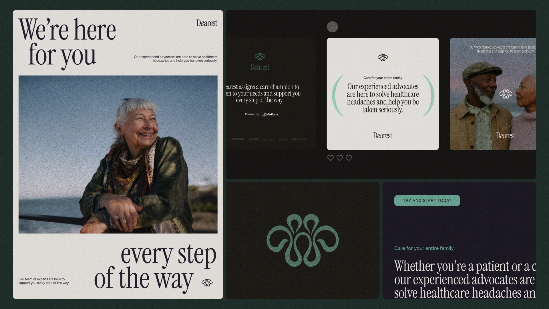
Renaming PairTu gave the company a more personal introduction, with a name that suggests affection, attention, and regard. It placed the relationship at the center of the brand before the service needed explaining.
We developed the positioning and narrative around trusted, personal healthcare advocacy, supported by a voice grounded in kindness, reassurance, and confidence. Together, the name and story gave Dearest a clear way to introduce itself to patients, advocates, and partners.
02
An identity that carries warmth with confidence
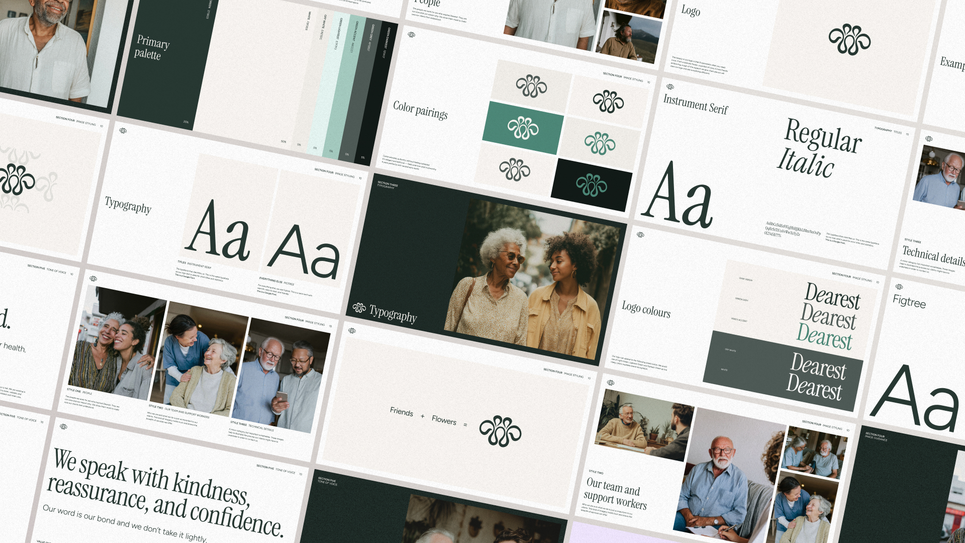
We built the visual identity around the friends-and-flowers mark, supported by a coordinated system of color, typography, and visual rules.
The work translated the character of the name into a practical design system, with guidance for consistent and accessible application. Across patient communications, partnership materials, and digital experiences, the identity gave the team a shared foundation for expressing care with clarity.
03
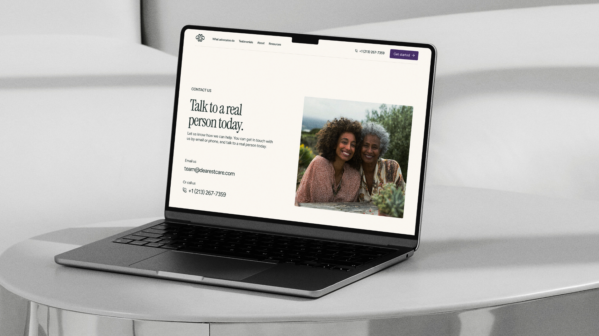
A website that makes the next step clearer
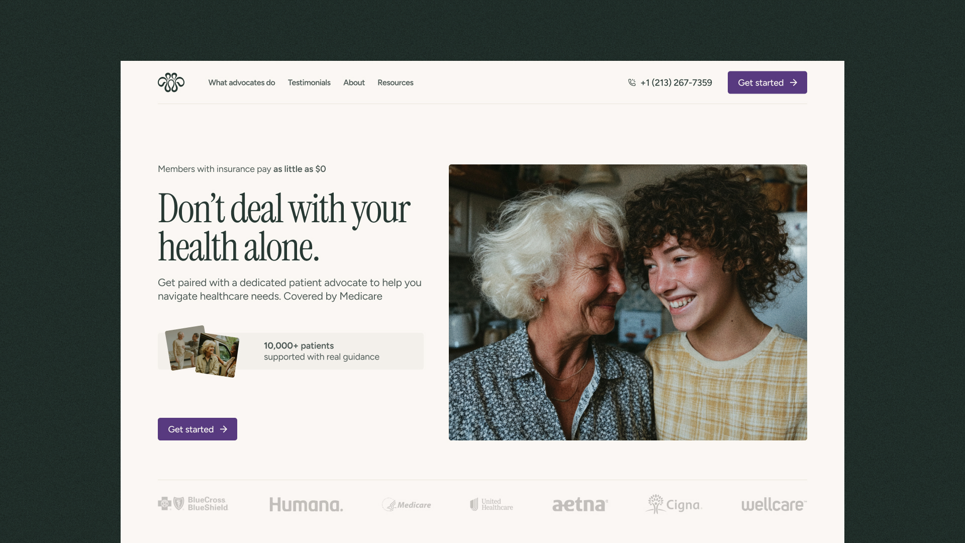
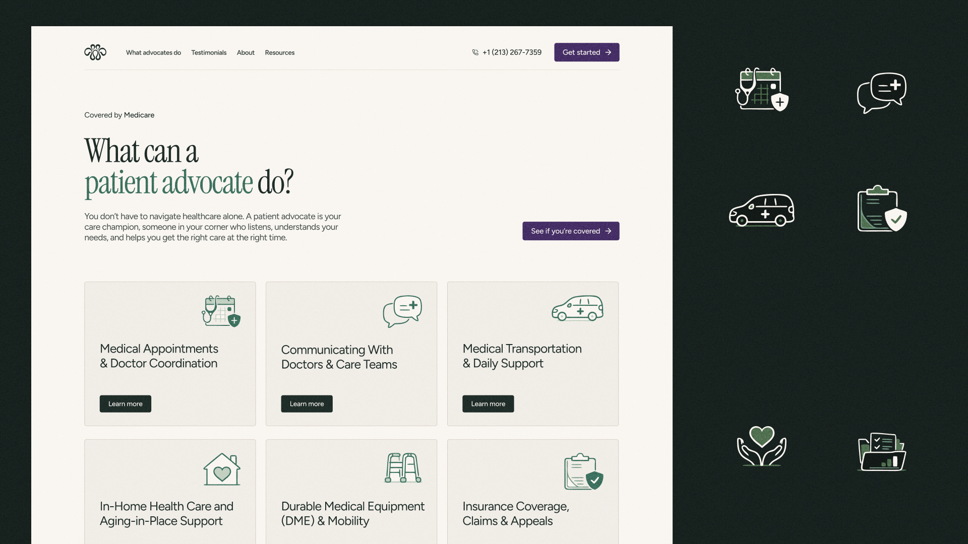
The website turned the brand into a public experience. We designed it to explain Dearest’s role, introduce the service, and help visitors understand how to engage.
The narrative and design worked together to make the information approachable and the path forward clear. Personal reassurance needed to sit alongside a straightforward explanation of what the company actually does.
BABCO carried the site through development, migration, and launch preparation, including measurement setup. Owning both design and implementation helped preserve the intended experience through to the finished website.
04
A recognizable presence from launch onward
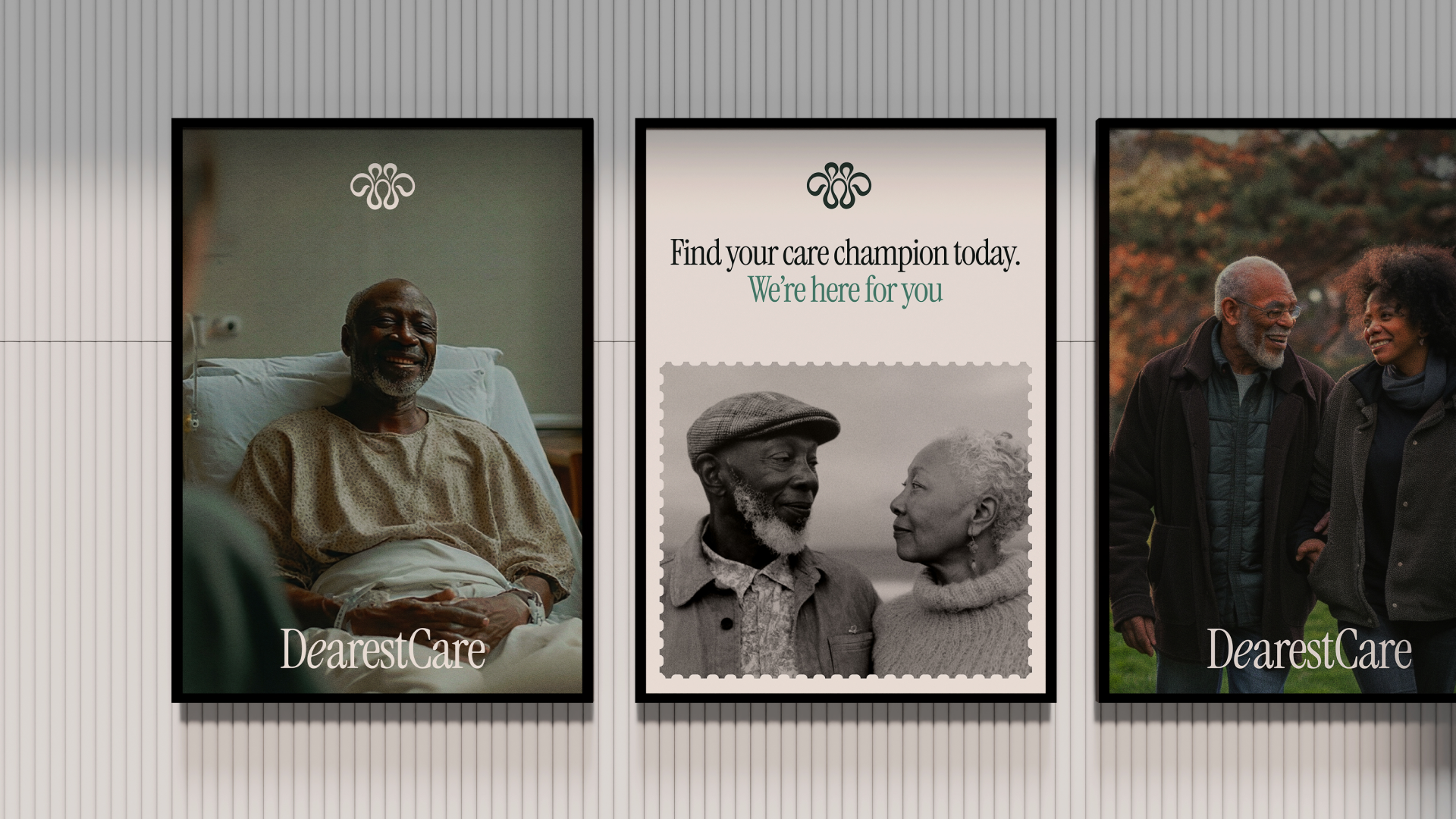
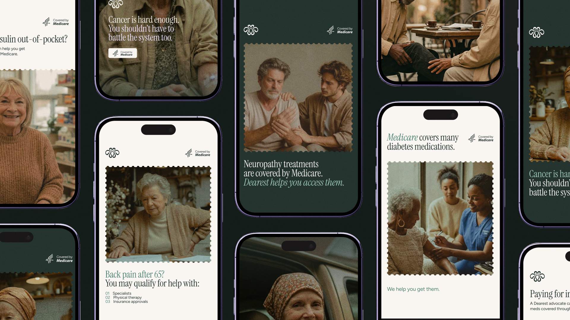
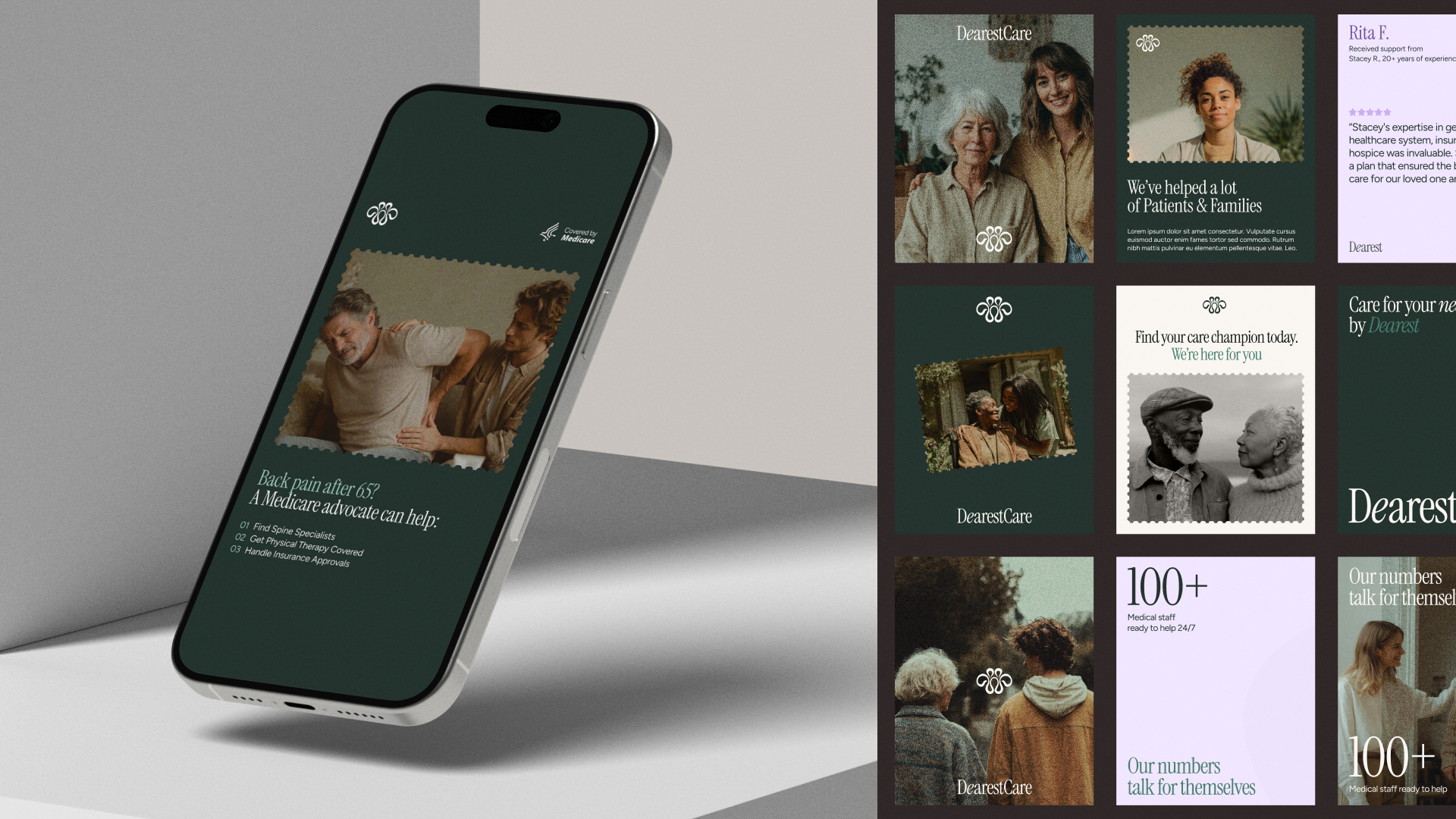
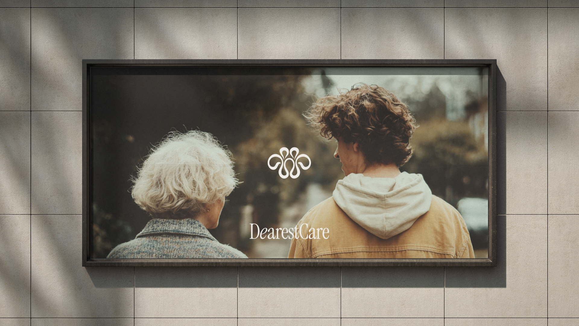
We created social templates, graphics, and an imagery direction that extended the identity into everyday communication.
The imagery centered on patients, advocates, caregivers, and families, with an emphasis on dignified, age-appropriate representation and human relationships. Reusable templates gave the team a consistent framework for sharing patient stories, advocate spotlights, and company updates across its launch channels.
These assets made the brand usable beyond the website, giving Dearest the tools to keep communicating as the company grew.
05
The same care throughout the experience
The brand extended into the Advocate Hub, patient portal, and partner-facing materials, connecting the public story with the places people would encounter the service more directly.
Applying the narrative and visual language across these surfaces gave Dearest a consistent expression from introduction through participation. The name established a personal promise; the wider system gave the company a way to carry it through.

Menu